Client: CariNo Health – health center and resort
Work: visual profile, logo, colors, typography
Program: Illustrator
Created by: Dora Marbl
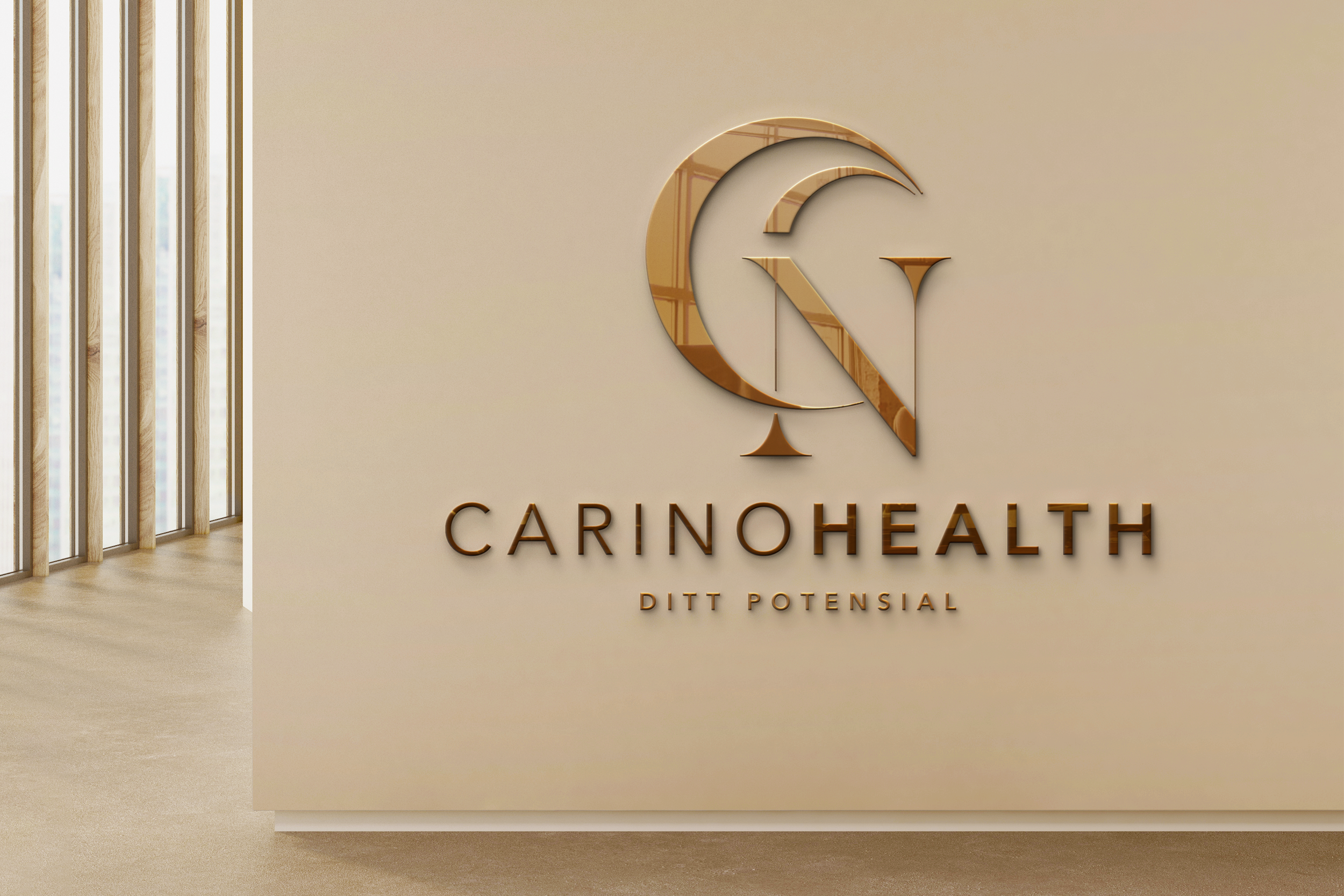
CariNo Health
CariNo Health is a healthcare center that values a holistic approach to health, and offers treatment packages including customized guidance in change of lifestyle and dietary, as well as stays at their resorts in the Caribbean, taking the relaxation to the next level.
The colors, orange and brown, are evocative of a warm and welcoming tropical sunset, and draws from the Caribbean connection, where CariNo Health operates health resorts. To top of the zen-vibe, the moon shaped ‘C’ represents the center’s focus on promoting restfulness and relaxation. The combination of the serif and sans-serif font is a perfect blend of modern and traditional, like CariNo's approach to healthcare.
Overall, CariNo Health's visual profile exudes warmth, sophistication, innovation and care. It’s like a hot cup of cocoa on a cold winter's day - it warms you up, makes you feel fancy, and reminds you to take a break from the chaos of life and indulge in some much-needed self-care.